The Art of Design: Unveiling the New Logo for Club Premium
In the world of web design and branding, a logo serves as a visual representation of a brand’s identity. It encapsulates the essence and values of a business, leaving a lasting impression on its audience. Today, we are excited to take you behind the scenes and share the story of the creation of Club Premium’s new logo. This emblem is not just an image; it’s a symbol of prestige, nature, and Swiss excellence.

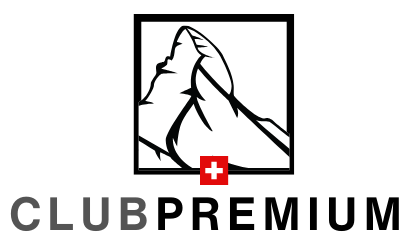
Club Premium’s new logo is a masterpiece that comprises several key elements, each with a unique meaning and purpose.
- The Majestic Matterhorn: At the heart of the logo, you’ll find the iconic Matterhorn mountain, nestled within a sleek black frame. This image represents the awe-inspiring beauty of nature, as if you were gazing at it through a window. The Matterhorn, with its striking peak, symbolizes exploration, adventure, and the wonders of the natural world. It’s an invitation to embark on a journey with Club Premium, discovering the pristine landscapes and experiences that await.
- The Swiss Flag: A touch of red and white, the Swiss flag, is prominently featured in the logo. This is not merely a nod to the country of Switzerland; it’s an affirmation of Swiss excellence. The « Swiss made » label is a globally recognized symbol of precision and quality. It tells you that what you’re getting is nothing short of perfection, reflecting the high standards that Club Premium upholds.
- Negative Space and Subdued Colors: The Matterhorn is depicted in negative space, rendered in dark, muted colors. This design choice embodies a sense of luxury and understated elegance. The darkness surrounding the mountain emphasizes its majestic presence and creates a visually striking contrast with the white flag. The use of subdued colors evokes a feeling of sophistication and class.
- The Timeless Helvetica Typeface: In the world of typography, few fonts can match the iconic status of Helvetica. The logo’s text is crafted using the Helvetica font, known for its timeless simplicity and readability. Created in 1957 by Max Miedinger in Basel, Switzerland, Helvetica’s design was driven by the pursuit of harmony and neutrality in type. It has since become a symbol of Swiss typography excellence and is favored by designers and typographers worldwide. Helvetica is one of the most widely used typefaces worldwide. It’s not just favored by designers and typographers; it’s also the choice of numerous renowned brands and organizations. Companies like Jeep, BMW, Lufthansa, Toyota, Microsoft, Scotch, Panasonic, Nestlé, The North Face, Caterpillar, and many more have used Helvetica in their logos. Even government entities, like the Canadian government, employ Helvetica as their official typeface.
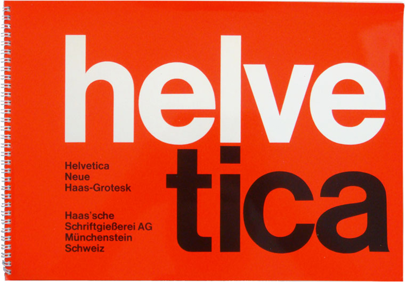
helvetica font
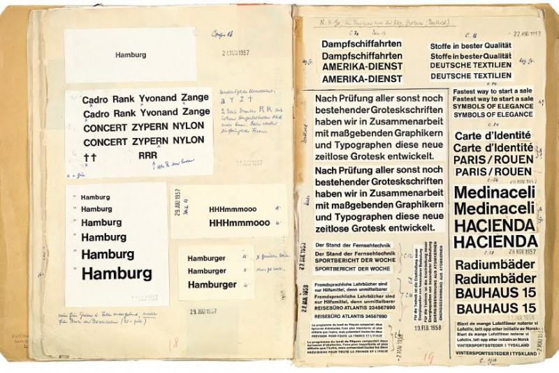
The ‘Helvetica Protocol,’ meticulously preserved at the Museum of Printing in Basel (Schweizerisches Museum für Papier, Schrift und Druck), consists of notebooks that document all the studies conducted to arrive at the final design of the Swiss typographic character.
The new logo for Club Premium is not just a design; it’s a statement. It tells a story of the brand’s commitment to quality, its love for nature, and its dedication to providing premium experiences. With the Matterhorn, the Swiss flag, the use of negative space, and the Helvetica typeface, every element has been carefully selected to create a logo that is both visually stunning and rich in symbolism.

Here is the final pictogram of the logo
This is an initial attempt at creating the clubpremium.ch logo.

Here is the initial version of the logo.
